🧩 Problem Statement
KAT Technologies needed a digital presence that:
- Clearly communicated their value proposition
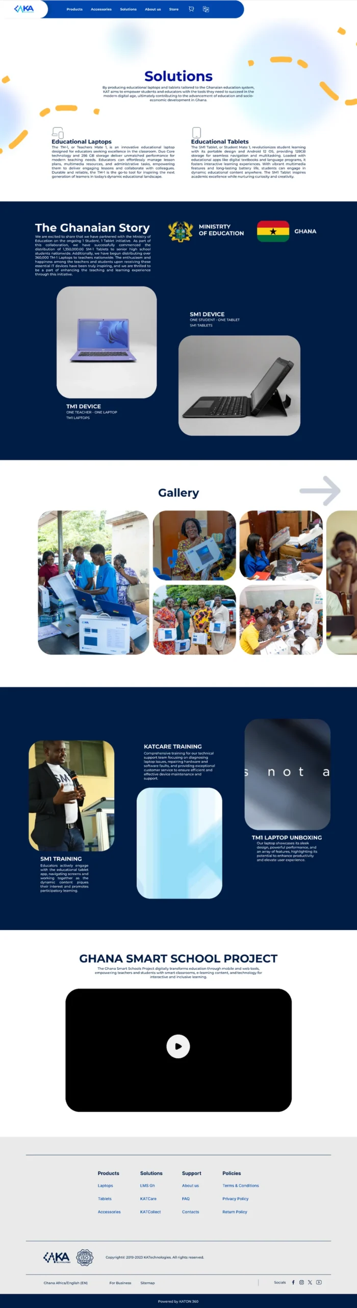
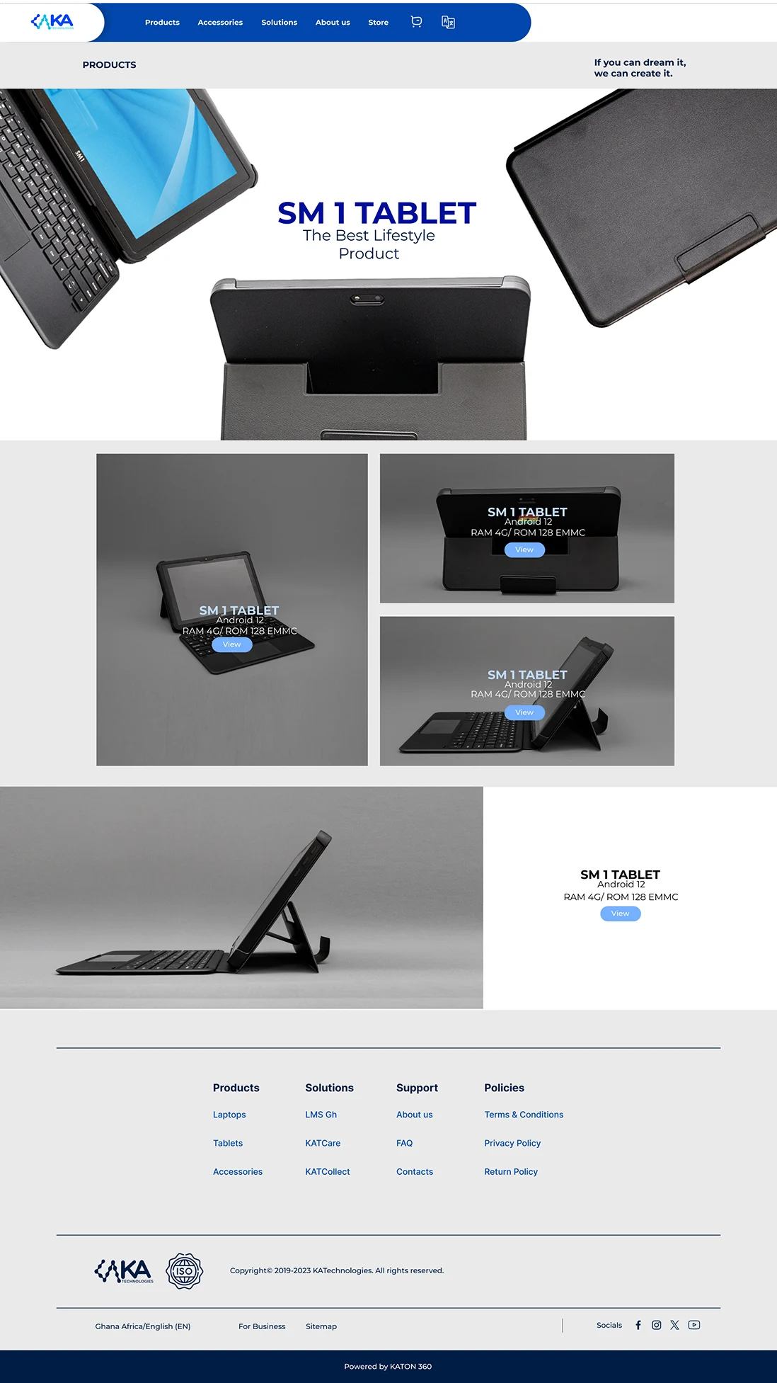
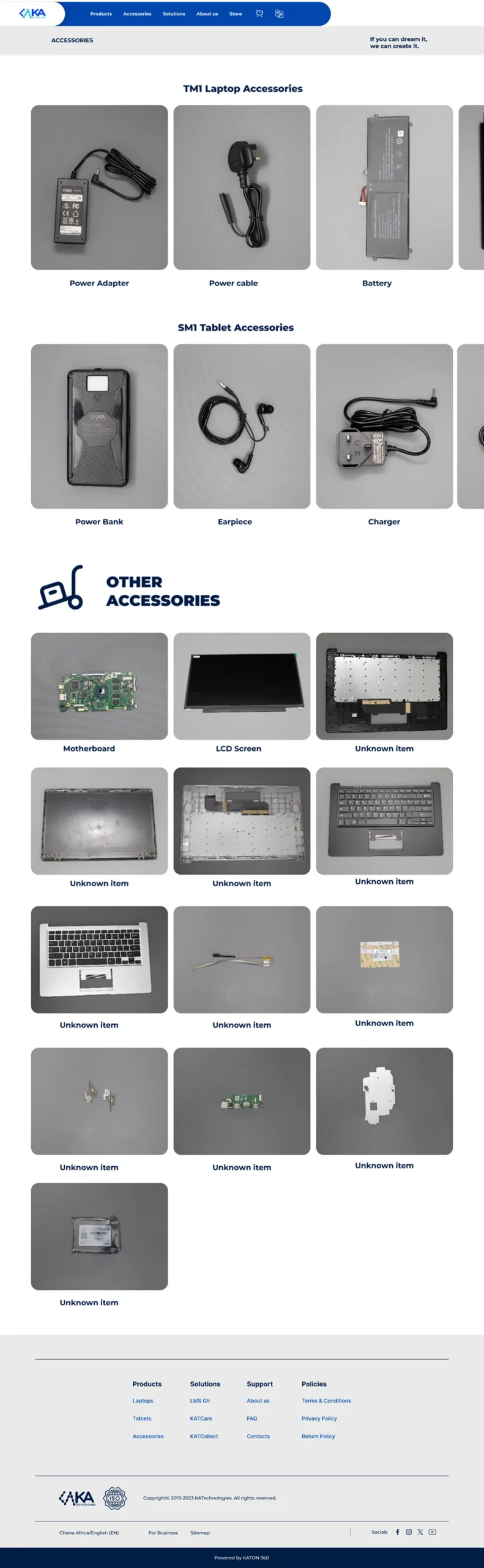
- Showcased product solutions like educational laptops (TM-1) and tablets (SM1)
- Built trust with clients such as government initiatives like 1 Student, 1 Tablet programs
- Provided visitors with a seamless discovery and contact experience
🎯 Project Goals
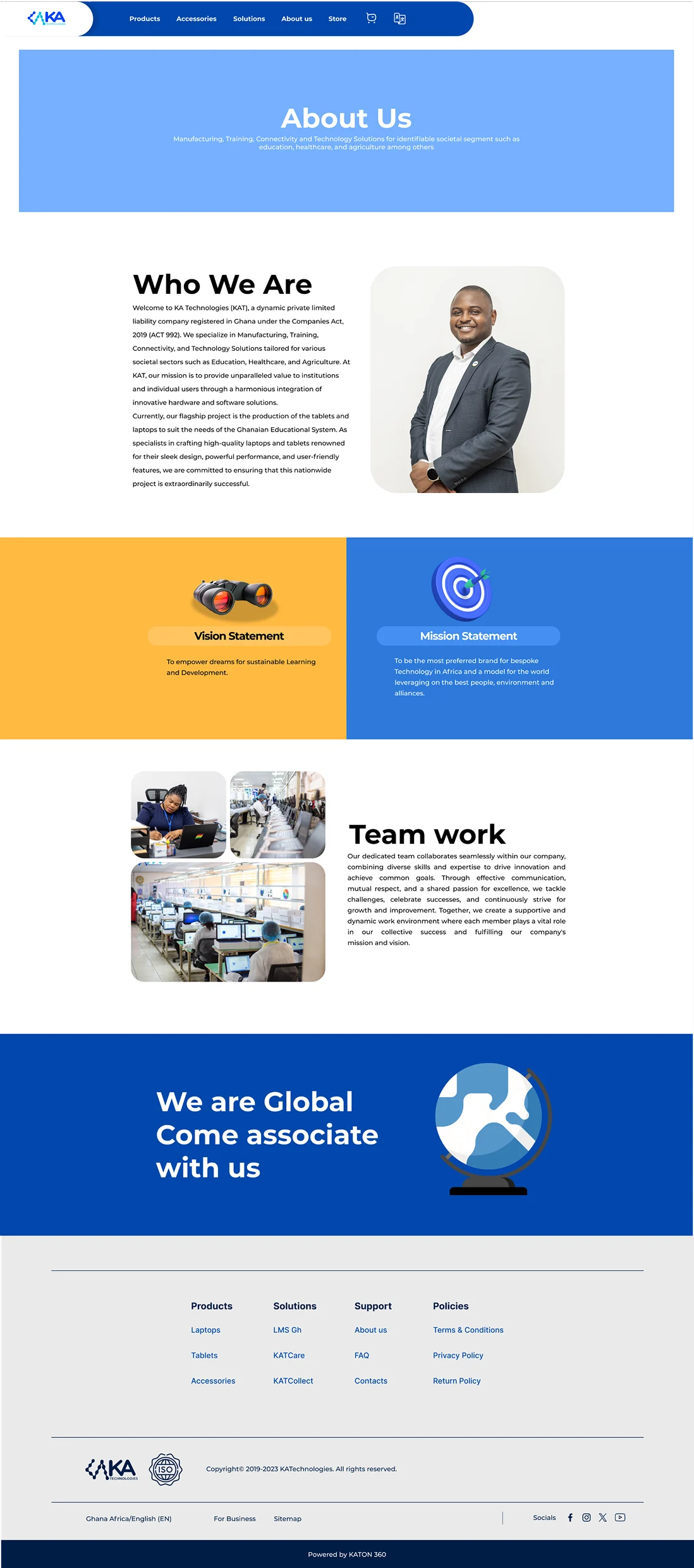
Improve user clarity on what KAT does
- Clear product and solutions sections
Strengthen credibility
- Highlighted certifications and partners
Facilitate contact and lead capture
Prominent CTAs & contact interfaces
🧠 Research & User Insights
Primary research consisted of:
-
- Stakeholder interviews with internal leadership to clarify business strategy
- Competitive analysis of regional and global tech solutions websites
- User testing sessions with stakeholders simulating real visitors
Key insights included:
- Users wanted immediate clarity on solutions and products
- Education stakeholders (schools, teachers, institutions) needed quick access to device specs
- Contact and support access was a priority
🧱 Information Architecture & Wireframes
Key insights included:
- Users wanted immediate clarity on solutions and products
- Education stakeholders (schools, teachers, institutions) needed quick access to device specs
- Contact and support access was a priority
🎨 Visual Design & UI Highlights
The visual design:
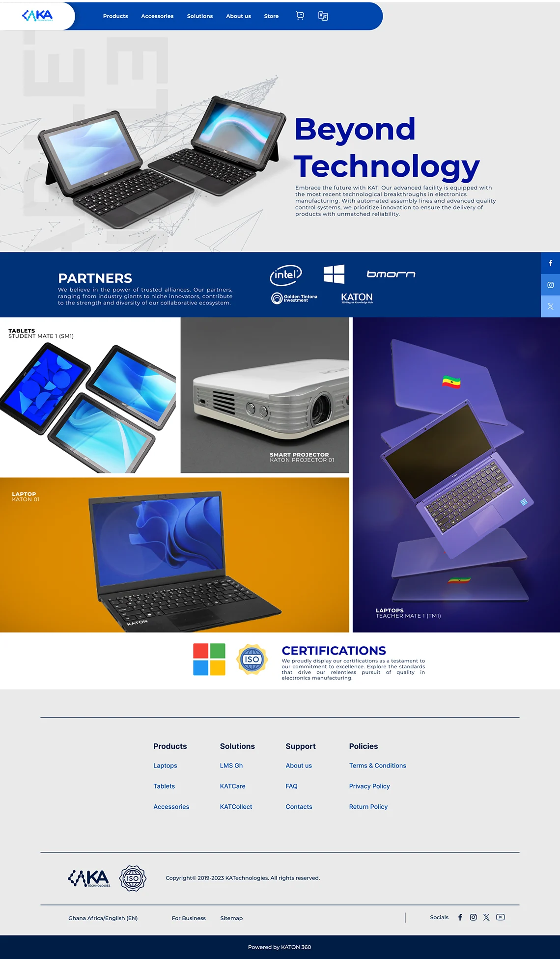
- Uses clean modern layouts that reflect technological professionalism
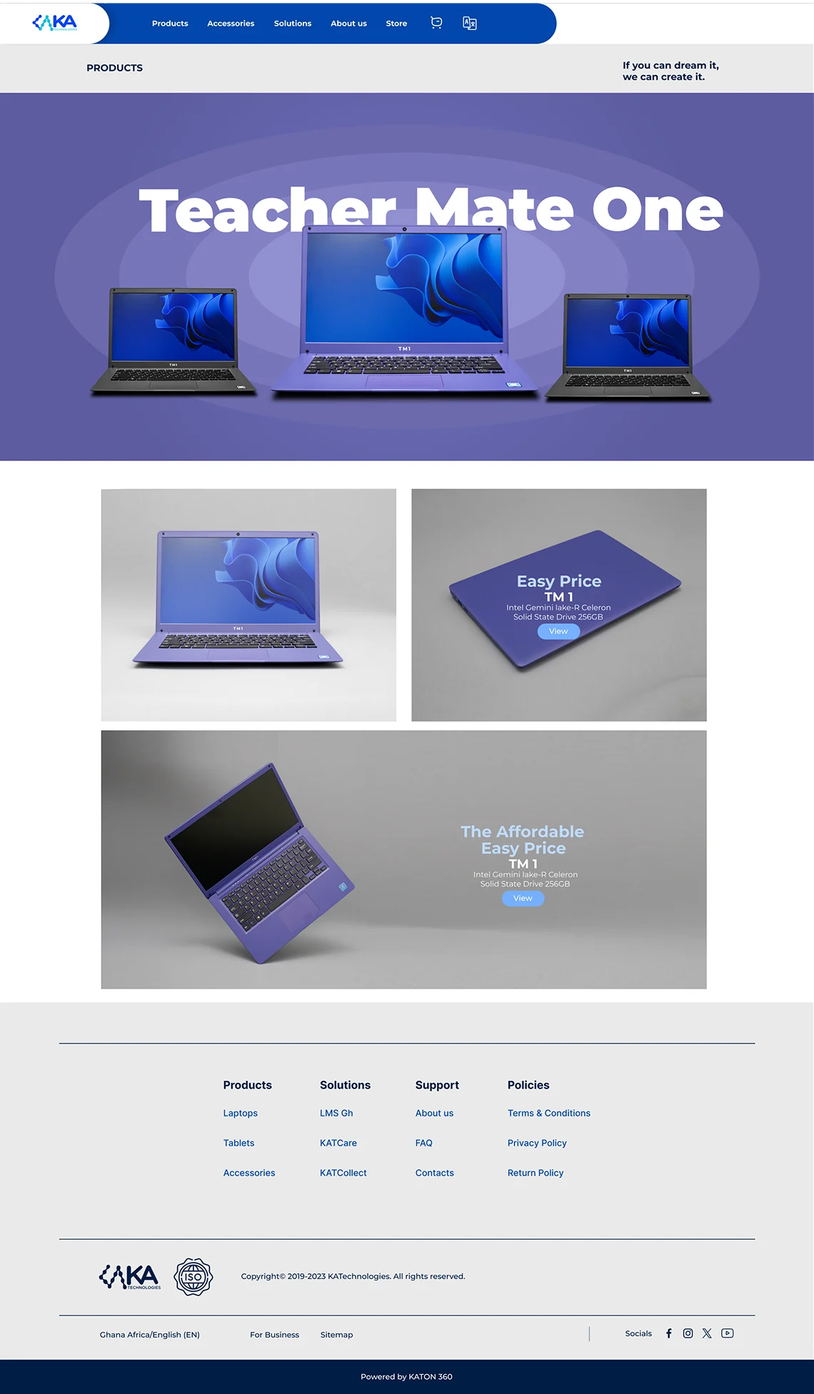
- Showcases high-quality product renderings of laptops/tablets (TM-1, SM1)
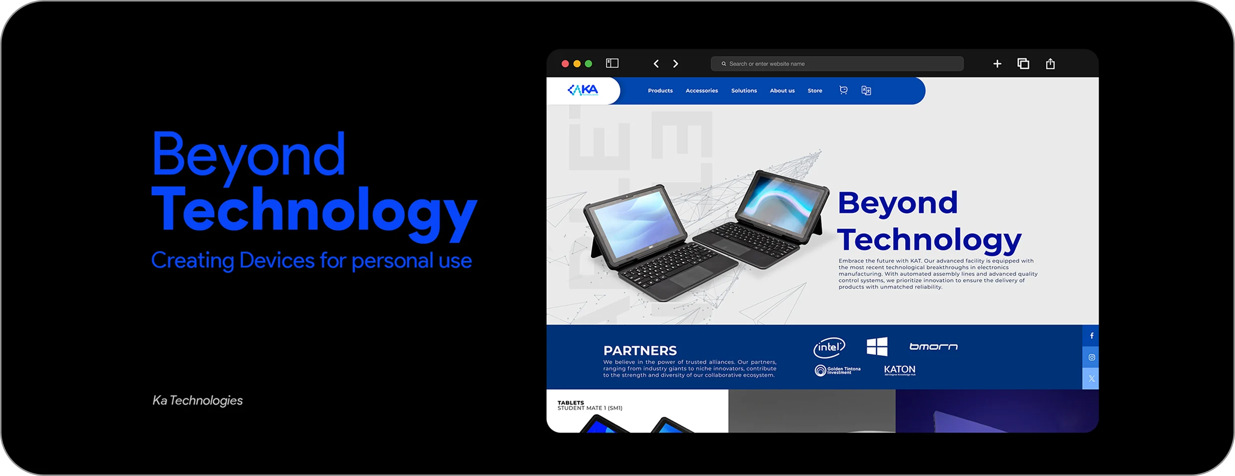
- Emphasizes certifications and partner logos to enhance trust
- Uses consistent typography and color to reinforce brand identity
Key UI patterns:
- Full-width hero with value statement
- Modular product cards with imagery and short descriptions
- Responsive grid layouts for solutions and services
- Clear Contact / CTA buttons across pages
🔁 Iteration & Collaboration
Worked closely with:
- Developers to ensure pixel-perfect implementation
- Content team to refine messaging and tone
- Stakeholders to align design with business goals
We validated designs through regular reviews and versioning, ensuring responsiveness on mobile and desktop.
UI View